Turium Design Guidelines
A guide to using the Turium brand consistently across products, platforms, and communications.
Effective date: March 2026
01 — Brand Identity
Using Our Logo
The Turium logo is the primary expression of our brand. It represents clarity, structure, and intelligence — the core principles behind Turium.
This section defines how to use the Turium wordmark and icon consistently across all touchpoints.
About Our Logo
Our logo represents multiple dimensions of what Turium stands for.
It reflects a system that gives structure to complexity and clarity to information.
- The flowing lines symbolize data streams being organized into meaningful patterns.
- The graphical form represents a complete system — interconnected, holistic, and always evolving.
- The vertical rhythm conveys precision, consistency, and structured intelligence.
- The overall form suggests a lens — helping users see through complexity with clarity.
“An intelligence layer that transforms scattered information into structured understanding.”
Primary Logo Lockup
Our primary logo lockup combines the Turium symbol with the wordmark, creating a unified representation of the brand.
This lockup is used across key touchpoints including:
- Product interfaces
- Dashboards
- External communications
- Presentations
- The website
It ensures consistency and reinforces recognition wherever Turium appears.
White Vertical Logo
Gradient Vertical Logo
Black Vertical Logo
White Horizontal Logo
Gradient Horizontal Logo
Black Horizontal Logo
White Wordmark
Gradient Wordmark
Black Wordmark
White Brandmark
Gradient Brandmark
Black Brandmark
Minimum Size
To maintain legibility and visual integrity, always respect the minimum size constraints.
- Wordmark: minimum width of 100px.
- Symbol/icon: minimum width of 32px.
Avoid scaling the logo below these minimum sizes.
Wordmark — 100px min. width

Symbol — 32px min. width
App Icon and Favicons
The Turium symbol is used as the foundation for app icons, favicons, browser icons, and compact product environments.
The icon should remain clear and recognizable at small sizes.
02 — Logo Usage
Using the Logo Correctly
Clear Space
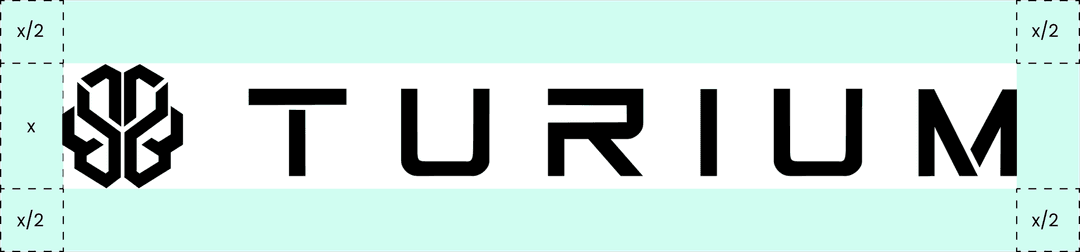
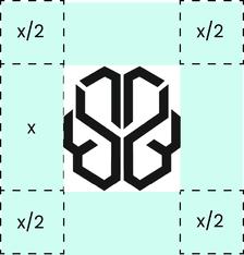
To preserve visual clarity, maintain sufficient clear space around the Turium logo.
No text, graphics, UI elements, or other visual elements should enter this space.
The minimum clear space should be proportional to the dimensions of the logo.
Always provide sufficient breathing room around the logo to maintain prominence and recognition.
Logo Attribution
When Turium branding is used externally, attribution may be required depending on the context.
Approved attribution formats include:
- Data by Turium
- Powered by Turium
- Insights by Turium
- Generated via Turium
Use attribution in contexts such as:
- Dashboards
- Reports
- Exports
- Embedded widgets
- Integrations with third-party tools
Attribution should be subtle but visible and should never overpower the primary content.
Good Usage
Use the Turium logo in ways that reinforce clarity, precision, and trust.
- Use only approved logo colors (typically black or white, depending on background).
- Ensure high contrast and readability across all surfaces.
- Maintain consistent spacing and alignment.
- Place the logo in clean, distraction-free environments.
- Use attribution alongside data outputs or insights.
The logo should feel calm, structured, and intentional.
Always prioritize legibility over styling.
Examples of good usage:
- Subtle attribution below charts
- Logo placed cleanly in the corner of dashboards
- Integrated into system UI without competing with important information
What Not to Do
Avoid any usage that compromises the integrity or clarity of the Turium brand.
Do not:
- Change colors, gradients, or effects on the logo.
- Distort, stretch, or warp the logo.
- Rotate or tilt the logo.
- Place the logo on busy or low-contrast backgrounds.
- Overlay the logo on critical data or visuals.
- Place Turium branding too close to competing identities.
- Use the logo as a decorative element.
Examples of bad usage:
- Logo placed inside charts or graphs.
- Logo replacing key metrics.
- Branding that overpowers the insights it accompanies.
“The logo is a signal of trust, not an ornament.”
03 — Typography
Using Our Typography
Turium's typographic system is designed to be clear, structured, and highly legible.
It reflects the way Turium operates:
- Precise
- Data-driven
- Minimal, yet expressive when needed
The system prioritizes clarity over decoration, ensuring seamless readability across products, dashboards, and communications.
Typography Hierarchy
H1
The future of intelligence
H2
Built for complex environments
H3
Clear, structured information
Body
Turium helps organizations connect data, intelligence, and people to make better decisions.
Label
System Intelligence
Font Weights
Aa
Bold · 700
Aa
Medium · 500
Aa
Regular · 400
Numbers and Data
Numbers are central to the Turium experience and should be treated with emphasis.
Guidelines:
- Ensure numerical information is highly legible.
- Make important metrics visually distinct.
- Maintain consistent formatting across data displays.
99.9%
System reliability
12.4M
Data points processed
24/7
Continuous intelligence
Typography Principles
- Calm, not loud
- Confident, not decorative
- Precise, not expressive
- Clear before complex
The goal is to let information and structure lead while typography supports clarity.
04 — Color System
Using Our Colors
“Structured on the surface. Intelligent underneath.”
At first glance, the interface should appear minimal and restrained.
Beneath that simplicity lies a system designed to communicate depth, state, and meaning.
Color in Turium is not used purely for decoration.
It is used to:
- Guide attention
- Indicate system behavior
- Represent data and outcomes
A largely neutral foundation allows key signals to stand out with clarity.
The goal is not to make the interface colorful.
“The goal is to make complex information clear and usable.”
Turium Grays
Turium Purple
Turium Purple provides the primary expressive accent within the brand.
Use purple intentionally for:
- Key interactions
- Highlights
- Brand moments
- Important emphasis
05 — System States
Functional Colors
Functional colors communicate system states and performance.
Turium Success / Positive
Successful actions, positive outcomes, confirmed states.
CMYK: 89/0/34/22
RGB: 22/199/132
HEX: #16C784
Turium Warning / Moderate
Warnings, moderate risks, attention-required states.
CMYK: 0/17/69/5
RGB: 242/201/76
HEX: #F2C94C
Turium Critical / Negative
Errors, critical issues, negative outcomes.
CMYK: 0/63/63/8
RGB: 235/87/87
HEX: #EB5757
Turium Success (#16C784), Turium Warning (#F2C94C), and Turium Critical (#EB5757) are the brand's dedicated functional colors for communicating system state.
Always pair color with text or icons. Do not rely on color alone.
06 — Brand Expression
Backgrounds and Gradients
Gradients can be used to create subtle depth and visual emphasis.
Use gradients carefully.
- Use subtle brand gradients for depth.
- Avoid flashy or excessive gradients.
- Keep surfaces calm and premium.
- Use gradients to support hierarchy rather than decoration.
Turium Gradient
#7C45E9 → #92B2F0
Turium Gradient Dark
#1F0A48 → #0A1F48
Turium Brand
Built with clarity.
Every element of the Turium brand is designed to create a consistent, clear, and intelligent experience. From typography and color to the way our logo appears across products and platforms, consistency helps build recognition and trust.